Creating “Menu” pages for the visually distracted
Got an email from a Mum this morning asking how to set up “Menu” folders within the food folder for her son who was easily distracted by too many choices.While we have plans to add category editing by the end of this year, there is no plan to break up folders into sub folders. Grace App is very much intended to be functional communication for the user: an appropriate means of getting exactly what you want without resorting to inappropriate behaviour. So it has to be the simplest means of navigating with the least effort, in order to make asking for something with Grace App, quicker and more rewarding than dragging or climbing, or acting out aggressively. It is intended to form the basis for independent communication, simple verbal sentences that anyone can understand.
Grammatical niceties like “I want to EAT a Cookie” are not important. You know that they don’t want to SEE a Cookie, or SIT on a Cookie – so just let them say: “ I Want COOKIE” and hand it over.
Once the person is fluent however, you might want to take control over their choices and this Mum was trying to make it clear to her son that only certain foods are on the menu at certain times so please make your selection from those – Fair Enough. Typical kids do not get to have chocolate cake for breakfast (unless I am in charge and I think chocolate cake is a GREAT breakfast, but that is just me)
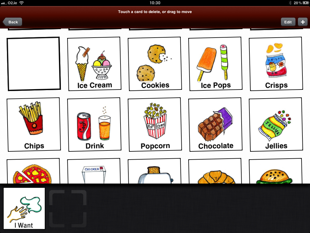
So I came up with a way to visually map out distinct choices on the Grace App. First, open the Grace App and click “Edit” in the top right corner. Then delete all the pictures that they never ask for. It is important to understand that this does not mean deleting things they cannot have. Typical children get to ask for stuff that is not good for them. So the special needs person has the same right. Just as you have the right to say no.
The top of the page goes red and all the pictures jiggle, then you just touch the picture you want to delete, click yes when asked if you are sure and it is gone in a puff of smoke. You can get them back later, just check page 6-7 of the Guide to Grace App
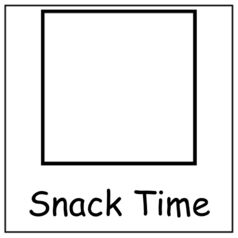
 Then I loaded a blank jpeg which you are welcome to use. Just click save here, then move it into your folder on the device you use:
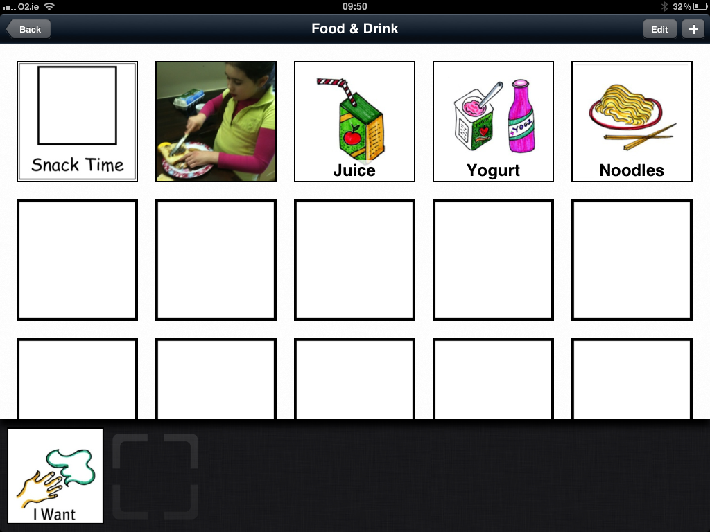
When this is in your album, you can then Open the Grace App, click + in the top right corner and add as many of these blanks as you like. Wiggle around the remaining pictures into an appropriate grouping, so that it looks like this:
So that is what Gracie might be offered at morning snack time. The chance to make toast, or noodles or yoghurt. She can scroll all the way down past the blank area and ask for chocolate or crisps if she wants to make the effort, but her Tutor will say no as Tutors are way more disciplined than us wussy parents who give in too easily. However, the easiest path will be to choose an appropriate snack.
You can see that I added in a title for the Mum who wrote to me. I did this using the excellent “PicCard Maker” by Tony Bo. You can get the free version or pay for PicCard Maker Plus for more features and no advertising. It is only €4.99 and well worth it.
Then I loaded one of my blank cards on to that and added the text to create the Category card, then added it to Grace App the usual way. I sent all this back to the Mum this morning and will be sure to update you with her feedback. Grace App is all about how we all use it. So if you have feedback or a suggestion, please do not hesitate to email me as you never know, if we get enough requests for the same feature, we will find a way to included. Just keep in mind; this is the USER’S app so follow what they need.
xx


Leave a Reply